These Are The Best And Worst Colors To Have In Your Outdoor Space
We may receive a commission on purchases made from links.
Your outdoor space is more than just a backyard — it's an extension of your home where style, comfort, and functionality come together. The decor you choose plays a big role in shaping the overall vibe, and color is one of the most powerful tools in your design arsenal. The right color palette can create a space that feels inviting and timeless, while the wrong choices might leave it feeling disjointed or outdated. Whether you're going for calm and cozy or sleek and modern, color sets the tone and could be an outdoor update that adds serious value to your home.
Unlike indoor spaces, outdoor areas face a unique challenge — constant exposure to weather and sunlight. Over time, these elements can affect how colors look and how well they hold up. Some shades naturally complement the textures of stone, wood, and greenery, blending beautifully with nature, while others may clash or demand more upkeep. That's why it's essential to find a balance between style and practicality.
With so many color options out there, it's easy to feel overwhelmed. Should you stick with neutrals, embrace bold statements, or follow the latest trends? To help you make sense of it all, Outdoor Guide has gathered expert insights from Sue Wadden, Director of Color Marketing at Sherwin-WIlliams, and Ashley Banbury, Color Marketing Manager at HGTV Home by Sherwin-Williams, a global paint and coating company. From timeless classics to trendy missteps, here's a guide to the best — and worst — colors for your outdoor space.
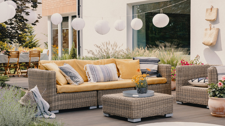
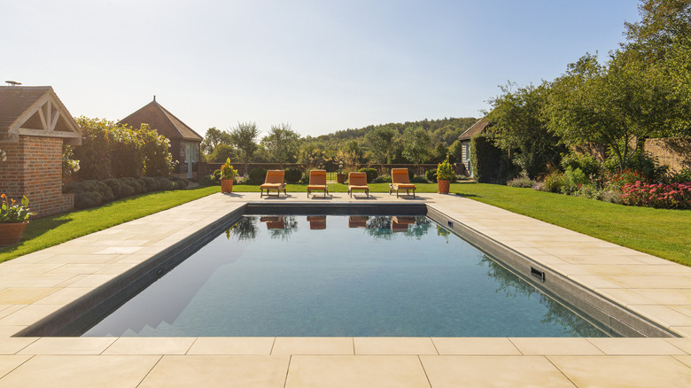
Best: Neutral tones create a calming atmosphere
As Wadden tells us, "Neutral tones like beige, gray, and white are excellent choices for outdoor spaces. They create a calm and inviting atmosphere and blend well with natural surroundings." These colors offer a sense of balance and tranquility, making them perfect for spaces meant to relax, entertain, or simply enjoy the view.
One of the biggest advantages of neutrals is their versatility. They work well with both modern and classic design styles and provide a timeless backdrop that allows accent pieces to stand out. Lighter shades like white and soft beige make spaces feel open and airy, making larger areas feel more inviting. Meanwhile, hues like gray add subtle depth and dimension, providing a sophisticated and grounding effect.
According to Banbury, "For a timeless look that can be incorporated into almost any neighborhood, select simple neutral shades like Alabaster (HGSW7008), Perfect Greige (HGSW6073), Black Fox (HGSW7020) and Aleutian (HGSW6241) that create an effortless sophistication." These colors not only stay in style year after year but also offer an elegant, polished finish that elevates any outdoor setting. By incorporating these timeless neutrals, you can create a serene haven that will continue to inspire and delight for years to come.
Worst: Neon colors overwhelm the senses
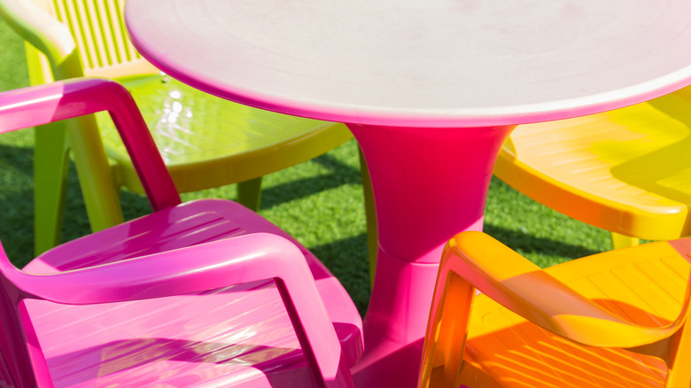
Colors like electric blue, neon green, and hot pink may seem playful, but, as Wadden warns, "Bright and overly bold colors like neon shades can be overwhelming and clash with the natural environment." These intense hues don't mesh well with the natural elements of stone, wood, and greenery that are present in many outdoor spaces. This creates a visual imbalance that feels jarring rather than inviting. Neon colors tend to dominate the aesthetic, compared to softer tones, making it harder to create a cohesive, calming environment. This is why using it as a primary color for furniture, walls, or large décor elements is risky.
If you're drawn to the vibrant energy of neon, consider incorporating it through more manageable and interchangeable accessories. This is a more balanced approach that allows you to enjoy the playful pop of color without committing to permanent design choice. Neon may work as a small accent — like a throw, pillow, planter, or piece of wall art. You can even display neon signs or neon lights to light up a pathway in the dark. These subtle yet impactful touches can effectively inject a dose of energy into your outdoor space while maintaining a harmonious aesthetic.
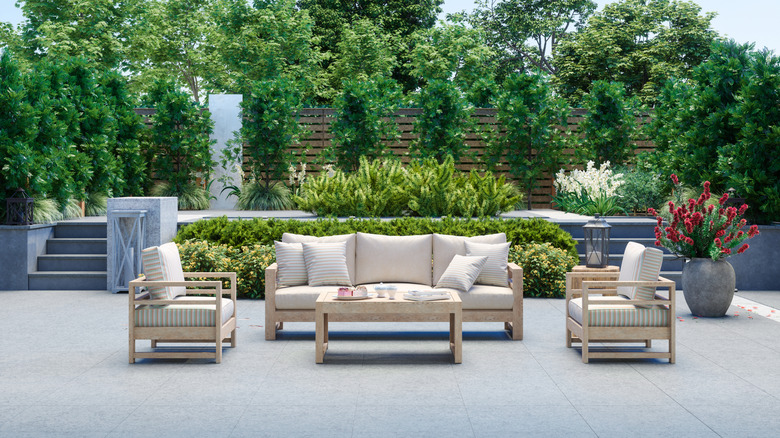
Best: Earthy tones bring a natural, grounded feel
"Earthy colors such as terracotta, olive green, and brown work well, as they complement the greenery and natural elements of an outdoor setting," explains Wadden. Since these colors draw inspiration from Earth itself with hues of soil, stone, and foliage, they create a harmonious connection between your outdoor space and its natural environment.
One of the key benefits of earthy tones is their ability to make outdoor areas feel warm, cozy, and inviting. Terracotta, with its rich, sunbaked warmth, pairs beautifully with rustic wood furniture and clay planters. Olive green echoes the lush greenery of nearby plants, while soft browns provide a rich, earthy foundation that complements both natural and modern design elements. Together, these colors create a cohesive look that feels tranquil.
Another advantage of earthy tones is their adaptability. As Wadden tells us, "these colors are versatile and timeless, making them easy to update with accessories and plants." This inherent flexibility allows homeowners to effortlessly refresh their outdoor space, such as with a stunning plant wall, without the need for major renovations year after year. Earthy tones offer a great neutral foundation, seamlessly accommodating a variety of design styles.
Worst: Trendy shades will date quickly
Trendy colors may feel fresh and exciting at first, but they often have a short shelf life. Hues that are "in" one season can feel outdated the next, leaving your outdoor space looking dated rather than timeless. While bold colors like millennial pink may seem to dominate design trends on social media year to year, they rarely withstand the test of time, and overusing them could make your outdoor upgrade a total money-waster. This is especially true for large, fixed elements like exterior walls, decks, or patio furniture. Imagine having to repaint or replace these elements every year to keep up with the latest fads. This can get costly and time-consuming — two things most homeowners hate.
Just like with neon colors, if you want a pop of color without risking a dated appearance down the line, utilize smaller, more easily, replaceable accents. Cushions and planters can add a touch of personality without making you commit to a long-term color scheme. Colorful umbrellas and canopies also offer a temporary and easily changeable dose of trendy color.
According to Banbury, "For a more traditional look with an extra dose of personality, pair traditional home colors like Pearly White (HGSW7009) and Cyberspace (HGSW7076) with a bright and punchy front door in a hue like Persimmon (HGSW6339)." This approach is great for reflecting your personal taste in your home without succumbing to the fleeting nature of design fads.
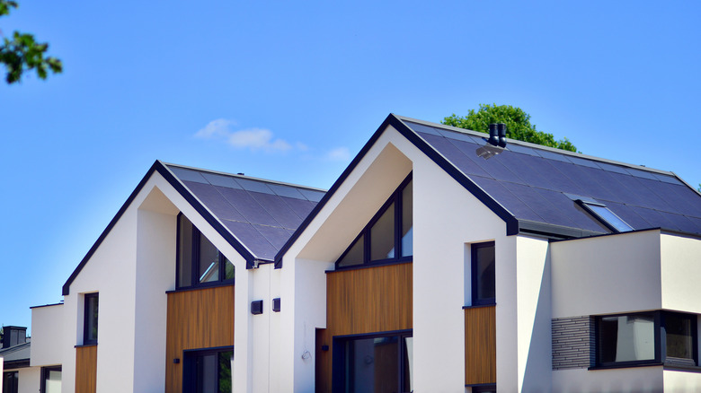
Best: Dark tones add depth and a modern edge
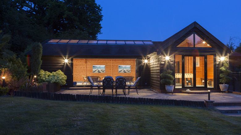
"Dark tones like black, charcoal, and navy blue are becoming increasingly popular for exteriors," explains Wadden. "These colors offer a sleek, modern look and can make a bold statement. They add depth and sophistication to your outdoor space, creating a striking contrast with lighter elements like trim, furniture, or natural surroundings." In addition to their bold aesthetic appeal, dark hues lend a sense of elegance and modernity to outdoor areas. Pairing them with natural wood or stone accents can create a balanced, high-contrast design that feels both refined and contemporary, especially if you've got a no-mow garden.
Another benefit of dark colors is that they tend to be lower maintenance, which is a huge plus for busy homeowners. They are better at camouflaging dirt and grime, which is great if you have kids around, or even if you live in an area with high levels of dust or pollen that can quickly soil lighter surfaces. Reducing upkeep is a huge win, since you can spend more time enjoying your outdoor space rather than working on it.
Worst: Dark colors fade more easily
There is often conflicting advice about using dark colors on your home's exterior. Yes, they offer a modern, sleek aesthetic, but this is highly affected by the type of paint or material that you use. As Wadden notes, "While dark colors like black or deep navy are popular for exteriors, there are some disadvantages as they can absorb heat, making furniture uncomfortable to sit on during hot days. Additionally, these colors can fade quickly under direct sunlight, leading to a worn-out appearance." Faded colors are definitely a sign that it's time to repaint your home's exterior.
Banbury echoes this sentiment, remarking, "While exterior home colors are entirely up to personal preference and aesthetic, there are some colors that are less suited for certain homes. For example, homeowners living in hot climates should avoid painting their exterior using dark hues as they can trap heat and ultimately raise the temperature inside the home."
Luckily, according to Wadden, "Advancements in paint technology have made it easier to maintain dark-colored exteriors. Modern exterior paints are designed to be more durable and resistant to fading, even in direct sunlight." She further explains, "UV-resistant paints ... help prevent colors from fading over time, ensuring that dark tones like black and navy blue remain vibrant." These are a great option if you prefer a darker aesthetic.
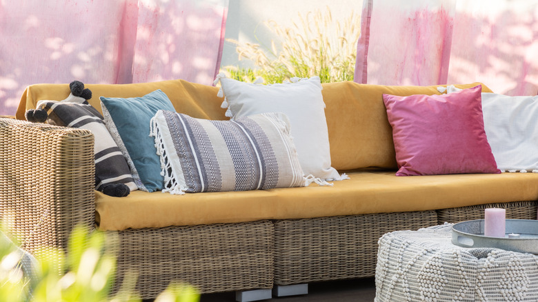
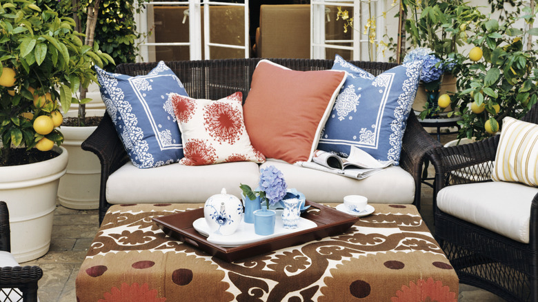
Best: Muted pastels bring a subtle playfulness
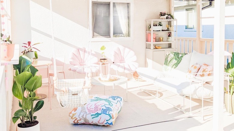
Muted pastels like to bring a sense of charm and playfulness to outdoor spaces. These soft hues, like pale blue, lavender, or blush pink, offer a subtle pop of color without feeling overwhelming, creating an atmosphere that's both inviting and calming. Muted pastels evoke a sense of serenity while adding personality to patios, decks, and gardens.
Unlike bold, flashy colors, pastels tend to blend harmoniously with natural elements like greenery, stone, and wood. They're versatile enough to be used on accent furniture, planters , and cushions, making it easy to refresh your space with seasonal updates. Pairing muted pastels with natural tones like beige or gray can create a well-balanced, cohesive look that feels both modern and timeliness.
Pastels also have the advantage of being less prone to fading than more vibrant hues, making them a low-maintenance option for outdoor design. They reflect light beautifully, which can help brighten shaded areas or smaller patios. They also evoke a sense of nostalgia. Remember those carefree summers from your childhood? Pastels are a versatile and whimsical choice that makes outdoor spaces more inviting for children and adults alike.
Tip: The position and direction of your house matters
Choosing a color scheme for your house is ultimately a personal choice, but there are other factors to also account for. As Banbury points out, "Two of the biggest things to consider when selecting an exterior color is which way the home is facing and how much sunlight it receives. Because the positioning of the sun can lead to shadows in certain directions, a home's color may look slightly different depending on how much sunlight or shadow is hitting its surfaces throughout the day."
Furthermore, shadows cast by trees or neighboring buildings can significantly alter the perceived color. A color that appears bright and cheerful in direct sunlight might actually be in shadow for much of the day, depending on your house's location, making it appear cooler and darker.
To ensure you make the best possible color choices, it's crucial to experiment with your color choices beforehand. "Before committing to an exterior hue, always test the color on all sides of a home to get an accurate picture of how the shade will appear under different lighting throughout the day," suggests Banbury. This will give you a realistic understanding of how the colors will appear under varying light conditions, allowing you to make an informed decision.
Tip: Your garden's landscaping matters
Beyond the interplay of light and your home, the greenery in your space makes a difference. "Outdoor landscaping impacts a home's overall color palette and homeowners should consider how foliage can complement or change the overall exterior aesthetic," explains Banbury. "For example, highly pigmented outdoor elements like grass and leaves can reflect onto a homes' exterior, giving it a slight green hue. Because this phenomenon mostly occurs in homes with lighter colored exteriors, homeowners who want to avoid a shift in hue due to nature's reflection should consider more saturated shades like Naval (HGSW6244), Pewter Green (HGSW6208) or Butterscotch (HGSW6377)."
Furthermore, you should consider the ever-changing nature of the landscape throughout the year. As the leaves and grass change hues and shades, this will impact the perceived colors of your outdoor space, too. As Banbury tells us, "Colorful neutrals work well in regions with multiple seasons, complimenting the ever-changing landscape." Selecting exterior colors that blend with the shifting seasons creates an enduring aesthetic that elevates the sense of harmony between your home and its surroundings.
Tip: Choosing furniture colors
No outdoor space, whether it's a patio or a deck, would truly feel complete without a seating area for family and guests to relax and enjoy the surroundings from. Furniture is a major element that influences the overall color scheme and aesthetic of your outdoor space, making its selection a critical part of the design process.
As Wadden emphasizes, "When choosing colors for outdoor furniture, consider the material and its susceptibility to weather conditions. For example, metal furniture in lighter colors may show rust less visibly than darker colors. Similarly, lighter fabrics are less likely to fade than darker ones. It's also important to choose weather-resistant materials and finishes to ensure longevity." Practical selections help ensure the furniture remains both functional and visually appealing over time.
"Classic colors such as white, beige, gray, and navy are timeless choices for outdoor furniture. These colors are versatile and can easily be updated with new cushions or accessories. They also tend to stay in style longer, reducing the need for frequent upgrades," Wadden further explains. Opting for these allows for flexibility while ensuring your outdoor space remains stylish over the years.
Tip: Your neighborhood's design also counts
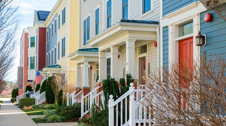
Visual cohesion can extend beyond your own property. According to Banbury, "In denser communities, it can be helpful to consider the colors of neighboring homes and determine whether to coordinate with them by selecting a complimentary hue or stand out with a bold accent shade."
There are many details you could take into consideration. "Fixed architectural features like wrought iron, roofing, natural brick and stone all contribute to a home's exterior color palette and can provide added texture and dimension," explains Banbury. "When curating exterior colors, consider how the selected shades coordinate and compliment the fixed features, as well as how paint placement and application can enhance these features. For example, implementing an all-over color can pull out the beautiful tones of natural stone or brick that often add texture and dimension to a homes' exterior."
When it comes to paints, technological advancements have made it much easier for homeowners compared to the past, according to Wadden. "Innovations include ... self-cleaning paints, [which] create a waterproof barrier that helps wash away dirt and grime with rain or a hose, keeping your exterior looking fresh with minimal maintenance." If you're looking for an environmentally conscious option, you're also in luck. Per Wadden, "Low-VOC and eco-friendly paints ... are better for the environment and reduce harmful emissions, making them a healthier choice for your home." Depending on the material of your house, deck, or patio, these could be viable options for paints.
Considerations for incorporating your personal style

Ultimately, incorporating your personal style into your outdoor space is crucial for creating a truly enjoyable and inviting environment. To achieve this without overwhelming your outdoor landscape, Wadden recommends "using a statement piece such as a brightly colored chair, a unique table, or vibrant cushions." She elaborates, "This allows you to express your personality while keeping the overall look cohesive. You can also use accessories like outdoor rugs, planters, and lighting to add personal touches without overwhelming the space."
Also, don't forget the impact of lighting. Patios and decks are also used at night, so unique lanterns, string lights, or statement pendant lights can create a magical ambiance.
Finally, remember that less is more. Resist the urge to over-decorate, as too many competing elements can create a cluttered and chaotic appearance. By carefully selecting and thoughtfully incorporating personal touches, you can create an outdoor space that is that is both stylish and uniquely yours.